How to choose the right logo style for your brand design
Last week I wrote a blog article all about the seven types of logo styles that every logo falls into. But maybe by the end, you were still unsure of what you would like to see for your business and what would accurately represent your style.
Let’s go over a little more in-depth the pros and cons of each logo style and how you can choose which is best for your business.
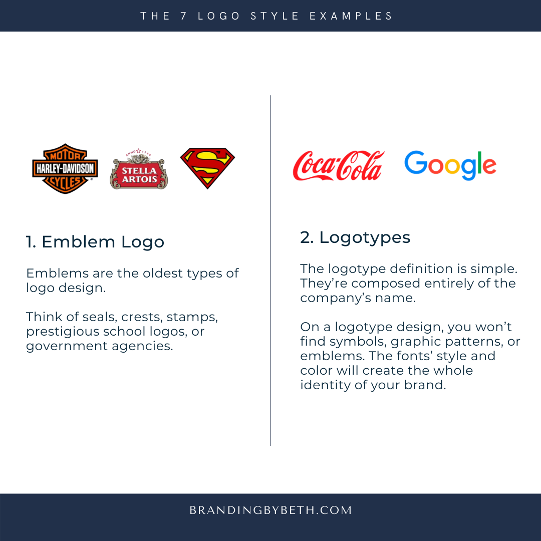
1. Emblem Logo
Pros: Once you come up with a good emblem logo, your brand will surely stand the test of time. Moreover, the chances to find another brand with a logo similar to yours are significantly smaller. They’re memorable, professional, and give a powerful feel to your brand.
Cons: Probably, the only disadvantage to the emblem logo is the scalability. Since they’re detailed, they may not look so good when resized to a smaller resolution or not so readable when placed on a billboard.
2. Logotypes
Pros: It’s a simple yet impactful way to get your brand’s name out there. Once you have the font and your logo’s style, you can mix it with other elements and create logo variations.
The logotypes also help new businesses that need fast recognition, or if your personal name gives your brand’s name.
Cons: The logotype won’t work if your brand has a long name. Also, in time you may have to change the fonts to keep up with font design trends.

3. Pictorial Mark Logos
Pros: Maybe your brand can be represented through a simple image/symbol. Think of Apple. Its name is also its symbol, and it works perfectly, as their name is drawn literally from the brand mark.
Another great way to use this type of logo is to convey a meaningful idea through a symbol, where the words can’t express it well enough.
Cons: If your business is still fresh and you didn’t manage yet to have a solid base and a stable target audience, it’s better to start with something more explicit for your brand’s logo and adapt it as a brandmark later.
4. Lettermark Logos
Pros: If your brand’s name has several words, then this logo kind is perfect for you, especially if you don’t want to use only a visual symbol.
a lettermark logo, it may confuse your audience. But this situation has an easy solution. At first, you can use your lettermark logo, and underneath it, place the full name.

5. Abstract Logos
Pros: With an abstract logo that still manages to showcase your brand’s identity, you’ll create something unique and instantly recognizable on the market.
Another reason can be the versatility of using it in advertising campaigns and on branded merchandise.
Cons: If you’re a new brand making a name for itself, you may have to put some extra effort in helping people know your brand’s reputation. The solution here is to create an abstract logo that conveys the specific feeling you’re aiming for, and maybe join in with the brand’s name for a while, just until people get to know you.
6. Mascot Logos
Pros: If your brand targets families and children, the mascot logo is a great way to go. It will help you establish a fun and friendly approach.
Cons: You definitely can’t use a mascot logo when your brand wants to send a serious, professional message.
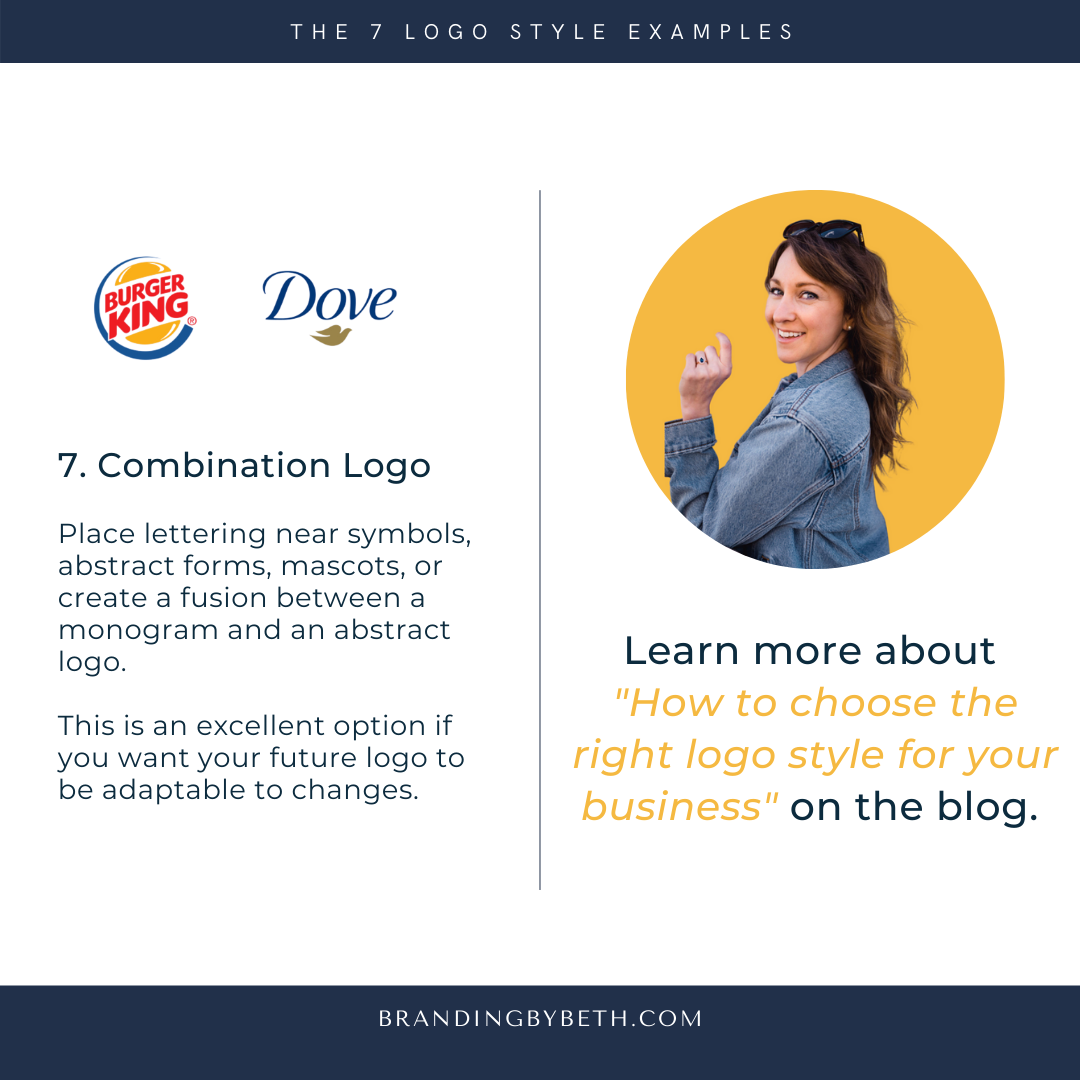
7. Combination Logo Marks.
Pros: This is an excellent option if you want your future logo to be adaptable to changes.
Cons: If you’re aiming for minimalism and simplicity, this type of logo may overload your visual branding.