Golden Ratio
Building a thoughtful financial brand around clarity, confidence + direction.
Industry: Bookkeeping + Financial Services
Services: Brand Strategy · Brand Identity · Creative Direction
Package: Brand Foundations
The Challenge
Golden Ratio was entering its next stage of growth and needed a brand identity that felt as thoughtful and professional as the business behind it.
The goal was to move beyond simply creating a beautiful logo and build a visual foundation that communicated clarity, organization, integrity + strategic guidance, while still feeling human and approachable.
And with a name like Golden Ratio, the details mattered. 😉
The Strategy
At the heart of the brand was one simple idea:
The Financial Compass
Golden Ratio helps clients understand their numbers, create better systems, and move forward with greater clarity.
That idea of direction + guidance became the foundation for the visual identity.
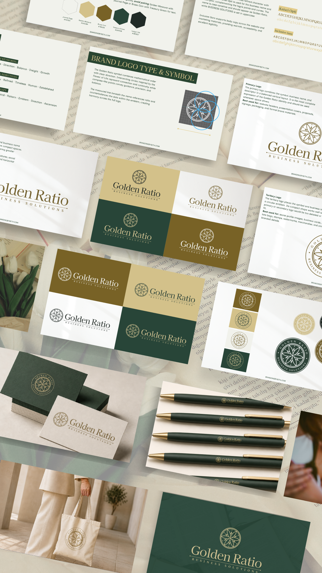
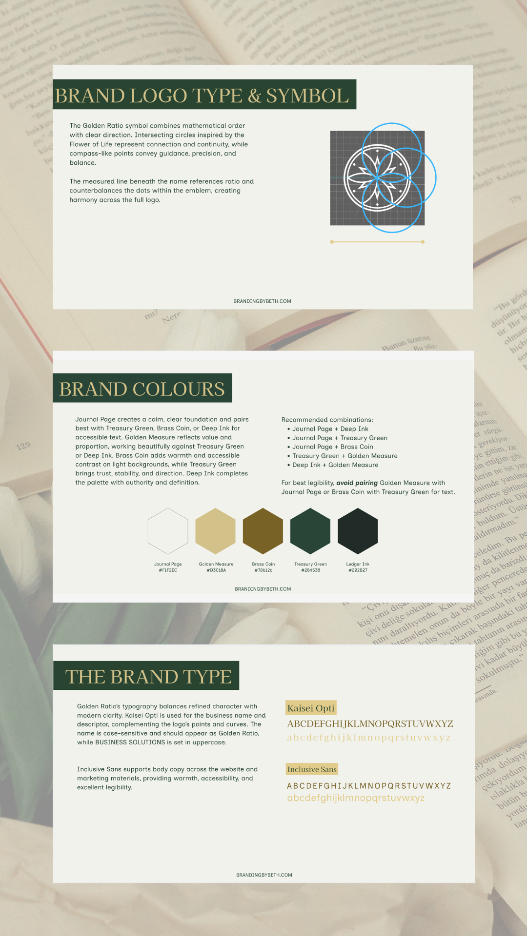
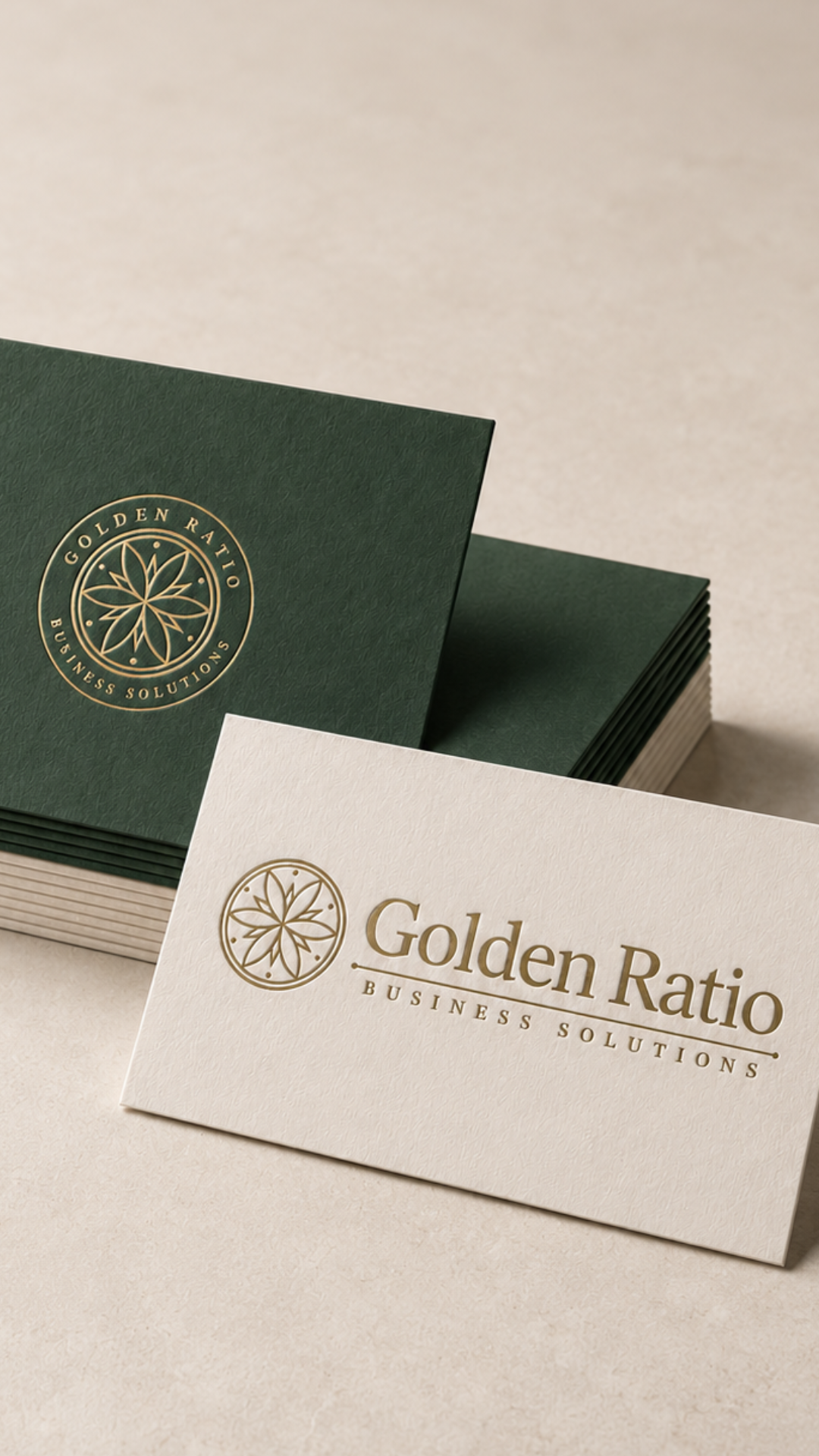
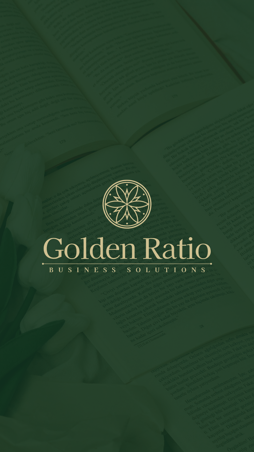
The final concept brings together intersecting circles, compass-inspired forms, mathematical proportion and subtle references to the Golden Ratio itself.
Every element was designed with intention, right down to the symmetry and proportions.
The Result
A brand that feels:
Professional, not corporate.
Strategic, not intimidating.
Polished, while still feeling human.
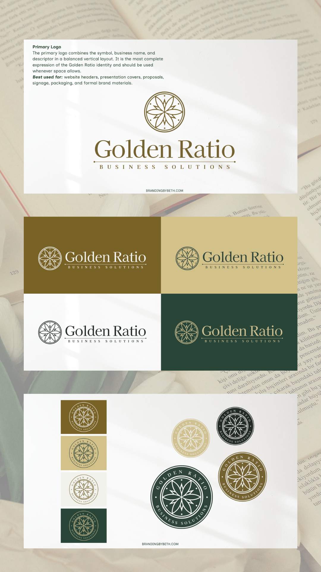
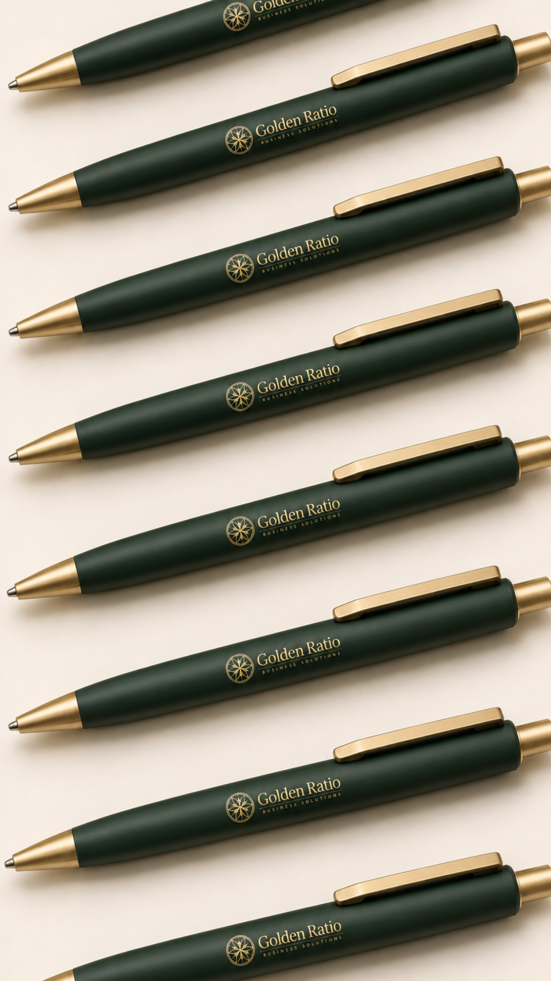
The finished identity gives Golden Ratio a cohesive foundation that can grow alongside the business, from its website and client experience to everyday marketing materials.
And perhaps my favourite part?
We landed on the concept in the first presentation. ✨
From there, it was about refining the details and making sure the final system felt unmistakably Golden Ratio.
The result?
A thoughtful, polished identity that feels completely her while giving the business room to grow.
“Beth absolutely nailed the concept on the first pass and understood exactly what I was looking for: a logo and brand identity that would give my business a confident, professional foundation for its next stage of growth. She also very patiently delivered on my very specific request for perfect mathematical symmetry (yes, I am that person, and she absolutely rose to the challenge!). I’m so happy with the final result. The brand feels thoughtful, polished, and very “me.” I was also really impressed by Beth’s process from start to finish. She has a well-structured, and well-communicated approach that made the entire branding journey feel grounded and clear — not at all as abstract as I thought it could be 😅 There were plenty of opportunities for communication and feedback throughout, and nothing ever felt rushed. I would absolutely recommend Beth to anyone looking for a designer who can take an idea and turn it into a cohesive, professional identity.”