Hacken
Corporate Training Brand Identity & Marketing Design | Canada
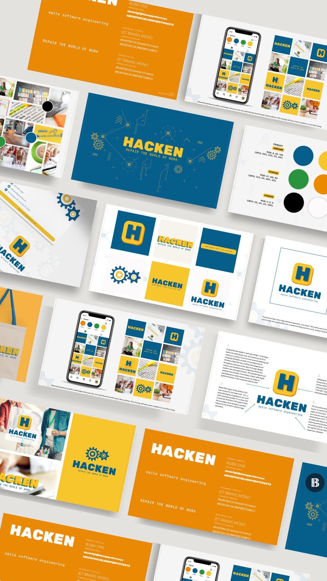
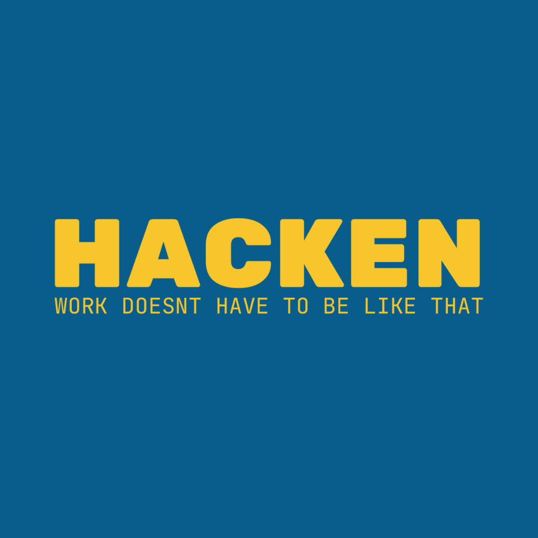
Hacken came to Branding by Beth looking to create a bold and memorable brand identity that reflected their fresh approach to workplace transformation. Built around the belief that work doesn’t have to be like that, Hacken develops engaging training programs and systems designed to help organizations move beyond outdated workplace patterns and create stronger, more connected teams.
Project Snapshot
Industry: Corporate Training & Team Development
Location: Canada
Services: Brand Identity • Marketing Design • Creative Direction
Platform: Print & Digital Marketing Assets
The Challenge
Hacken needed a visual identity that would stand apart from traditional corporate training brands while communicating the energy, optimism and innovation behind their work. The challenge was creating a brand that felt professional enough for corporate environments while remaining engaging, approachable and memorable.
The Strategy
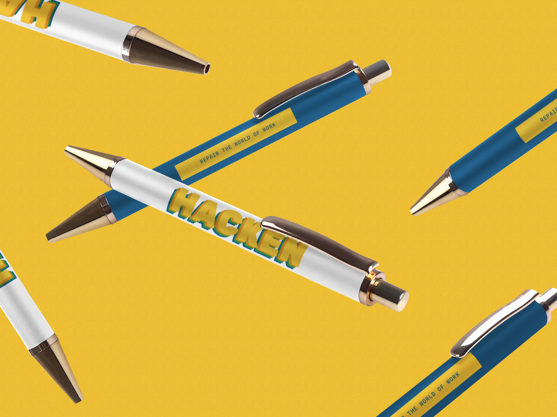
We developed a bold and energetic visual identity designed to bring personality into the workplace space. Through bright colours, intentional design choices and a “geek chic” visual direction, we created a brand system that balanced professionalism with playfulness. Gear-inspired elements were integrated throughout the identity as a representation of collaboration, systems and the many moving parts that support stronger workplace experiences.
Mood Words:
Bold • Innovative • Playful • Energetic • Collaborative • Memorable
The Outcome
The result is a cohesive brand experience that gives Hacken a stronger presence across both digital and print platforms. With a recognizable visual system and marketing materials designed for consistency, the team can confidently communicate their services while creating stronger connection with organizations and teams.
Scope of Work:
Brand Identity • Marketing Design • Creative Direction